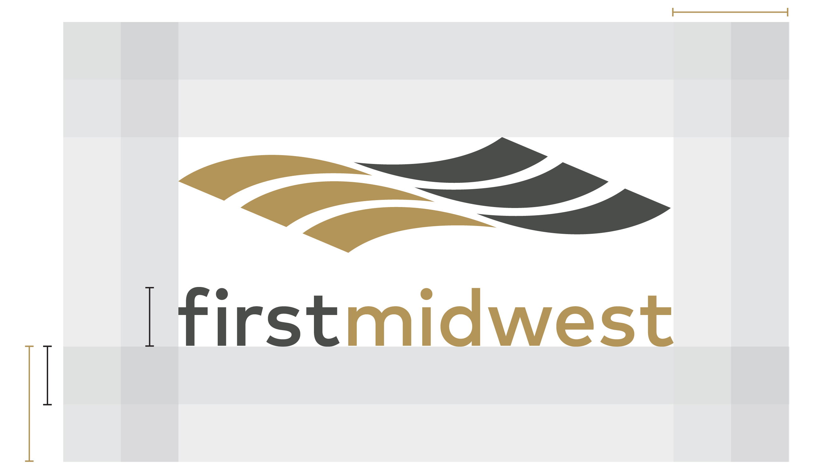
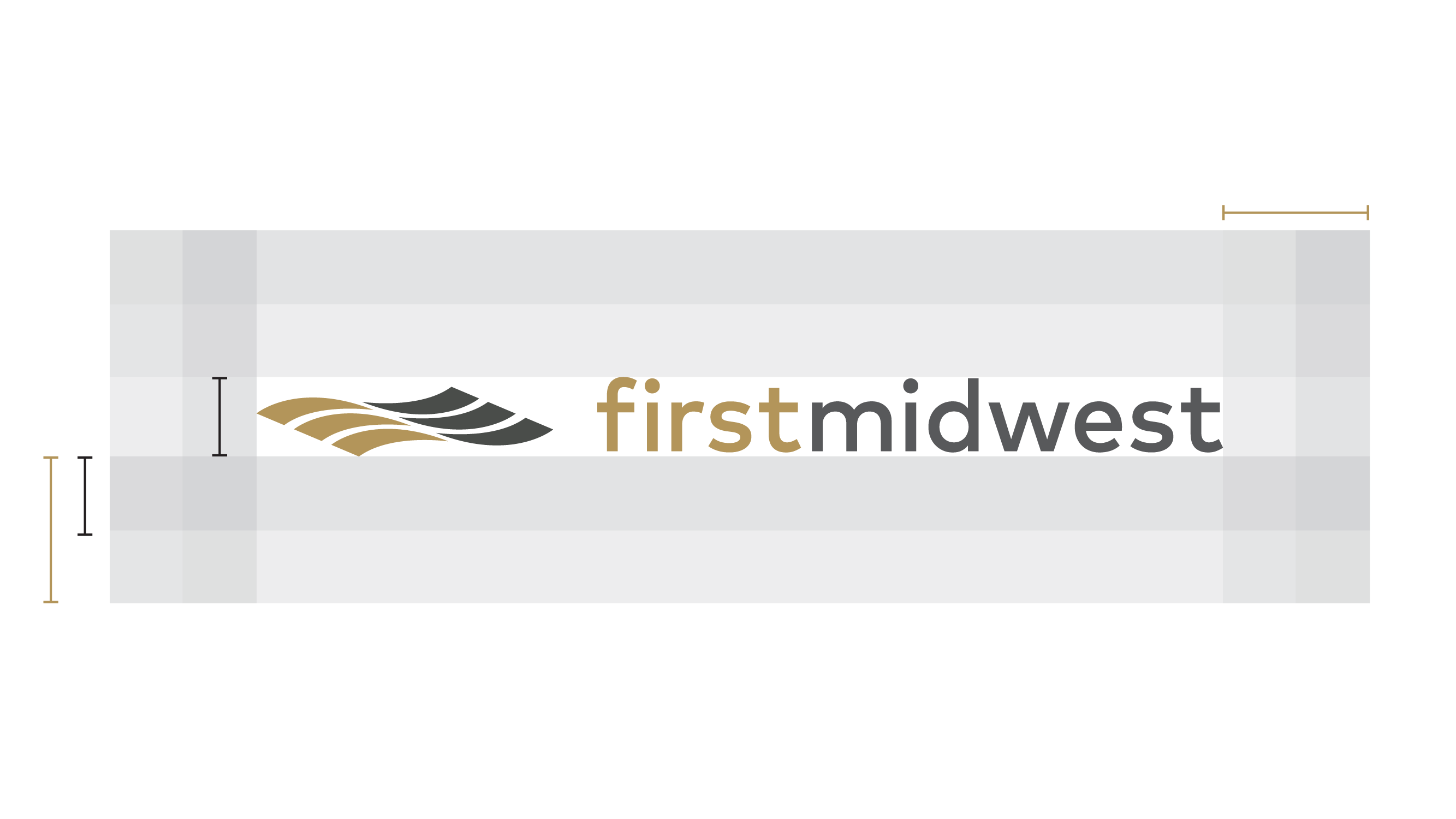
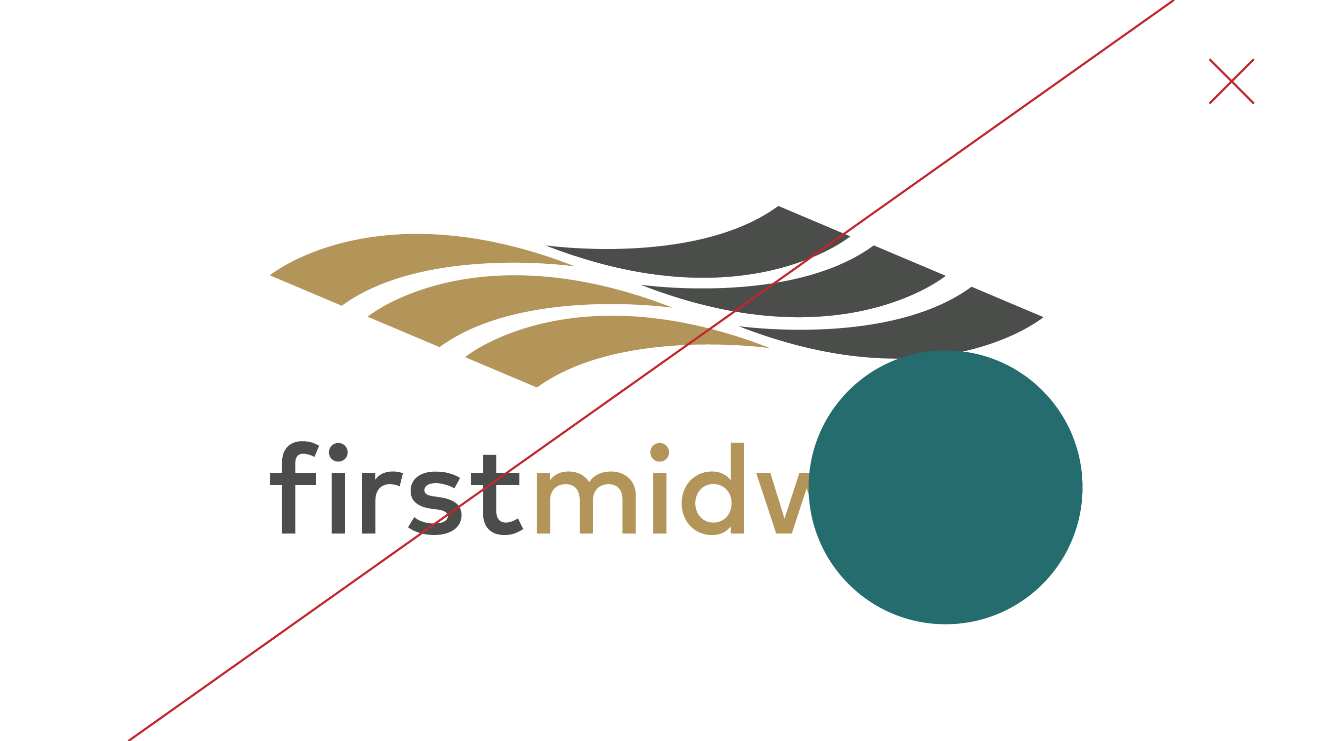
The First Midwest word mark has been developed to express clarity, strength and modernity. The simple letterforms have been optically kerned and carefully weighted to maximize legibility at all sizes.
The sans serif type choice was selected to add a modern look to a legacy brand, evolving to meet user needs in a digital space. The word "bank" has been removed from the word mark to differentiate the brand and create more versatility in design.
The sans serif type choice was selected to add a modern look to a legacy brand, evolving to meet user needs in a digital space. The word "bank" has been removed from the word mark to differentiate the brand and create more versatility in design.

